Thank you to the Asia Art Archive Indian curator team who shed some insights on Mrinalini Mukherjee’s artistic practices. Born in Mumbai in 1949, Mukherjee studied painting before she found herself intuitively drawn to sculpture. In 1978, she attained a scholarship to study at West Surrey College of Art and Design in Farnham UK where she studied sculpture. She is known for her daring experimentation with unconventional materials e.g. dyed hemp, and using an intuitive and laborious process of working with her hands to create unusual, mysterious, figurative, and, at times, grotesque and erotic forms that look like ancient, wizened spiritual beings.
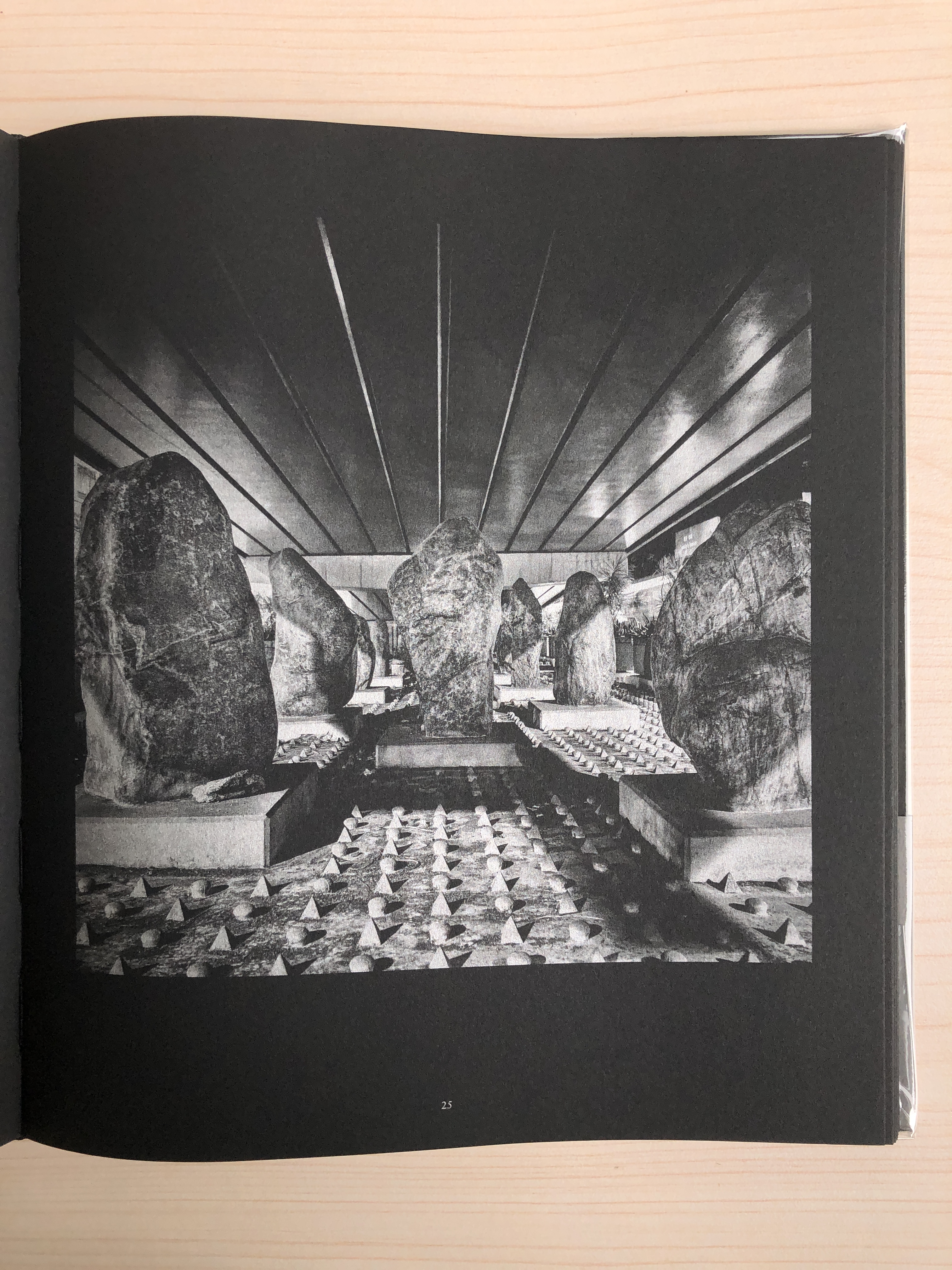
As one walks into the Asia Art Archive CCG Library, you’ll immediately find a textile sculpture in its standing form, like a flopping gown that becomes its fully flourished form on a mannequin (image above). This is the only sculpture present at the exhibition, the rest of the exhibition consists of photographs that are displayed in varying forms.
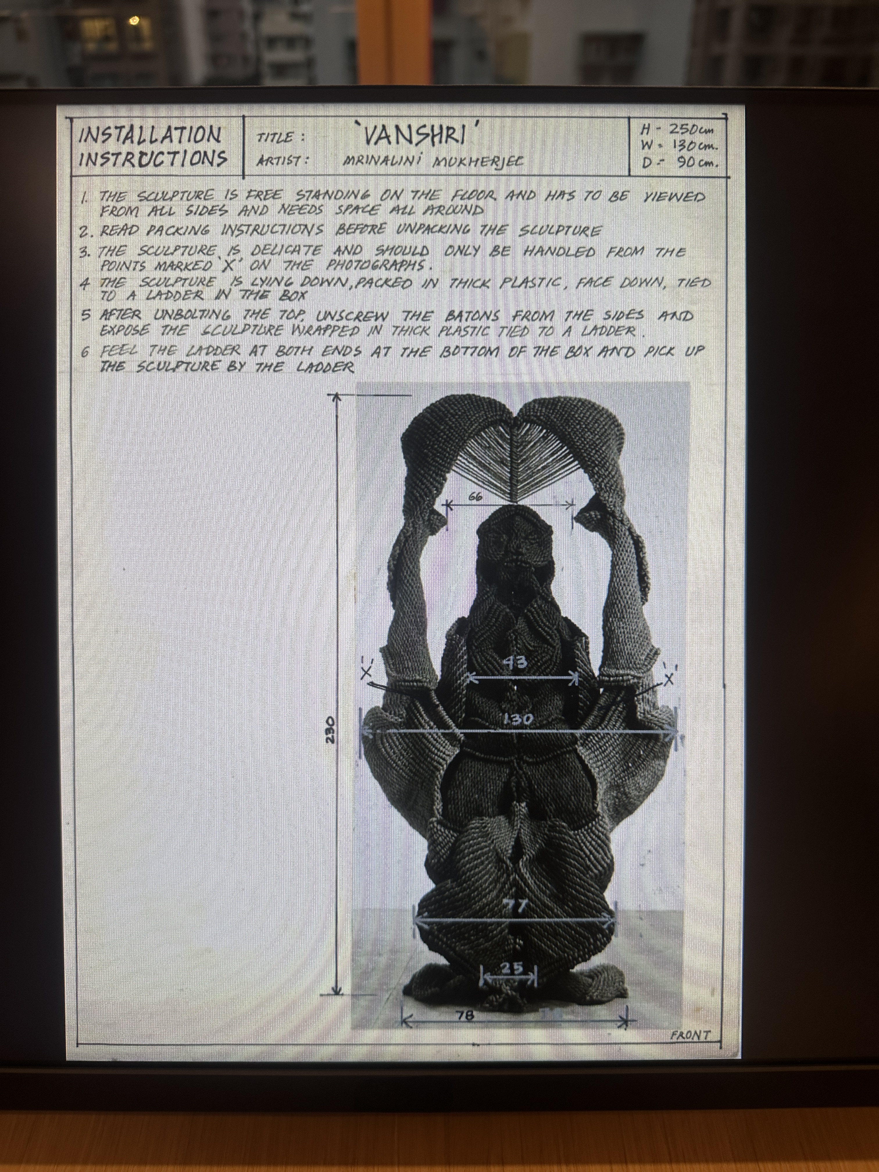
photographs as inspection: selected contact sheets are blown up to the size of the glass wall. The photographs are of fully standing sculptures taken meticulously from different angles. Mukherjee uses photograph to document her sculpture work. Photography becomes a way to fix the form of her sculptures. It is also her way of understanding her own sculptural work and the artistic processes behind. She would carefully choose the “best” photograph to use it for creating installation instructions (image on the left).
photographs as a reflection of time: there are a few small screens that display animations of Mukherjee’s photographs from her contact sheets. The curator team created these animations to not only mirror the daily repetitive task of Mukherjee’s sculpture work, but also to explore and reveal her work as a reflection of time.
photographs as instructions: since the digitalisation of Mukherjee’s archive, it allows reproduction and circulation, as well as scaling them into different sizes. A few of her installation instructions (with texts and photographs) on how to install her work are shown on four sides of the pillar at the library, as well as on an interactive screen at the side table. Here, photography offers a precise method to reproduce her sculptures. The instructions not only reveal the steps to installing the sculptures, measurements of how the work should look at the end, it also provided methods of how to pack the work for transporting to different exhibition spaces (images above).
photographs as art-objects: on the window side of the exhibition venue, there are a few overlapping layers of panels, displaying Mukherjee’s 135mm slides. Audience can slide the panels and use the provided magnifying glass to look at the slides. The 135mm slides here become art objects where audience can touch and hold Mukherjee’s sculpture on their hands (images below).
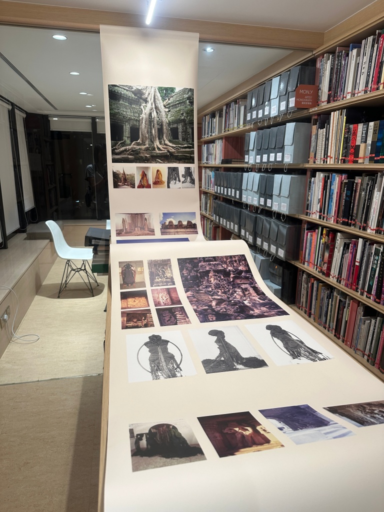
photographs as references: as you enter into another room on the far left of the exhibition space, there is a big sheet in a wavy form, showing Mukherjee’s photographs during her travels, referencing nature she encountered, dancing bodies on temple, performance of mystical stories, folk art and local crafts that informs her inspiration for her sculptural expression (image on the right).
The exhibition demonstrated the multiple functions of photography, shedding lights on the contemporary scene of photography and hopefully opens up conversations on the potentials of how photography can be used.
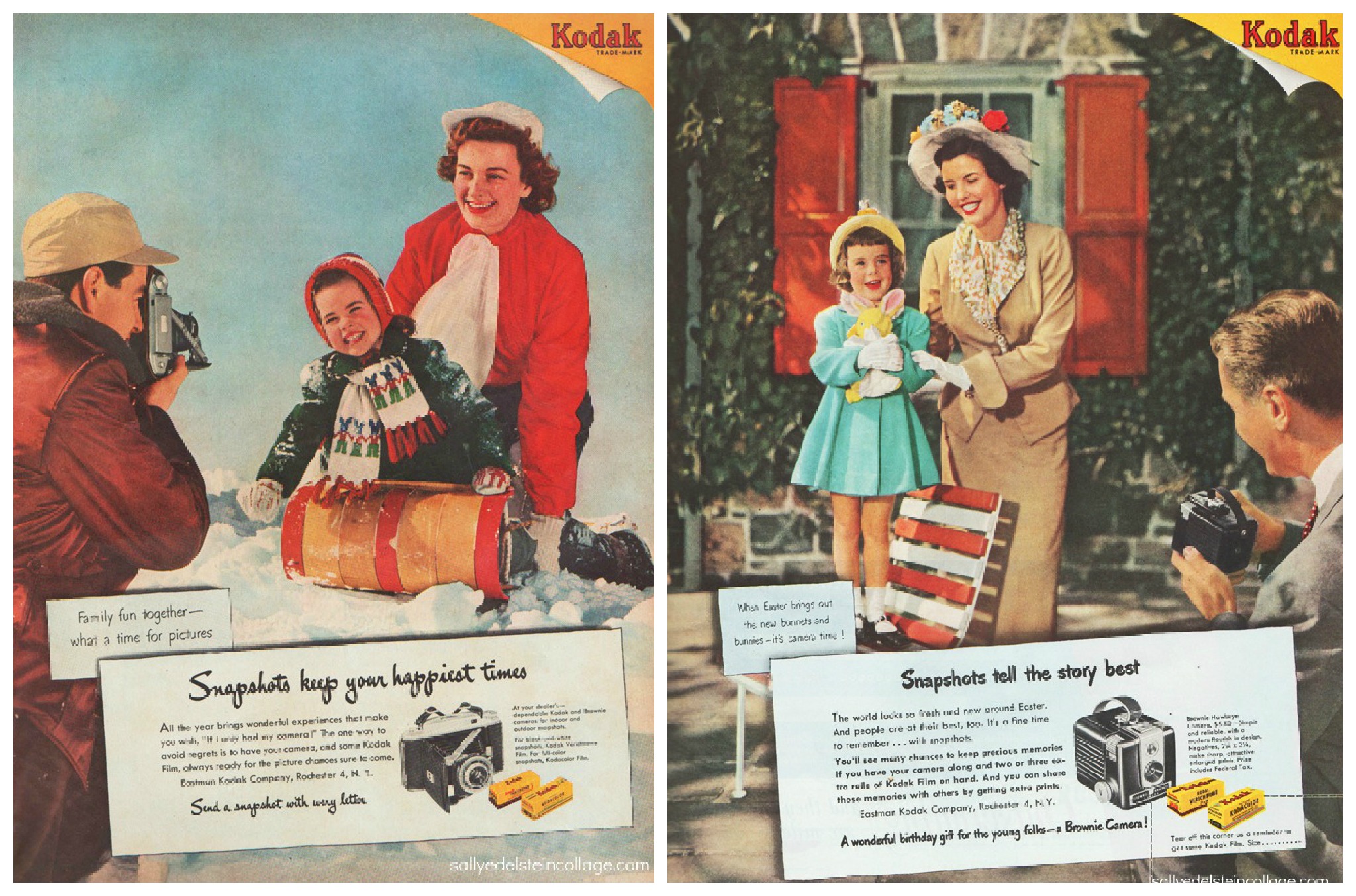
The birth of Kodak Brownies has led to the popularity of snapshot and domestic photography. These practices have become even more pervasive with the advent of digital and phone cameras. Recording an event has become part of the event itself. This ritual is especially prominent in family photography.
I am an artist who works with images. As I looked through my family photographs that were scanned and archived on my computer, I noticed that in these photographs, my family members, relatives and I were often posing and smiling. The photographs almost always display happy memories of a particular time.
Why do we pose and smile when we take family photographs? How did we develop the ritual of documenting our family lives that way?
This is a photograph of me, my sister and my cousin, playing on the beach in 1990. We were immersed in sand play, digging a big hole which looked like we were going to make a well. Perhaps we were going to collect water from the ocean, using the buckets to fill up the hole. The photographer, who was my father, saw this moment, came over and asked us to smile for the photograph.
Here are two other family images, both taken in 1988. The image on the left was taken during a Christmas and New Year celebration at my uncle’s (二伯) flat in Mei Foo. My cousin (堂妹), my younger sister and I were wearing big fake plastic earrings. My other cousin (堂弟) wore a pair of plastic heart-shaped sunglasses. All the children were seated in front of a Christmas tree in carefully directed postures. My sister was placed on the rocking chair. I was seated behind my sister, slightly towards the right. Others were seated next to me in a row. My youngest cousin who was wearing a red jumpsuit was placed in front of her elder brother, so that she could lean her back against him. I became suspicious while looking at this photograph. It made me question whether the children were intentionally being positioned and dressed that way, so as to perform for the camera and have a record of this celebratory occasion.
The image on the right was a celebration of my grandmother’s birthday. All the family members and relatives gathered together that day to have dinner with my grandmother. It was an annual ritual for my immediate and extended family. In this photograph, my cousins and I are seen playing with the mah-jong tiles before dinner was served. I suspect the photograph might have materialised only after several attempts. My cousin on the right looked impatient while gazing at the camera. My other cousin in yellow tried to make a funny face. The boy in the middle and I (extreme left) held our smiles while we looked askewed from the gaze of the camera. If there were a contact sheet for the images taken that day, what would the sequence of images look like? Could there be more than one photographer documenting this moment?
I have no recollection of these particular events. I cannot recall any pleasant or unpleasant experiences from my memory. What I can remember though is an impression of the photographic encounters from these family events. All the relatives would hold their own cameras to take photographs of us, each of them wanting their own pictures of their children and their cousins. There was no consensus, and there was no communication. It was chaotic. The experience was confusing and frustrating. However, despite the chaotic experience, the product from these photographic encounters only reveals smiley faces, signifying happiness at these moments. They only project happy feelings when we read them in the present.
Since the nineteenth century, Kodak has monopolised the snapshot photography market. The corporation shaped the conceptualisation and cultural habits surrounding photography by creating a culture of using photography as leisure. They used perfect images of happy families in advertisements and magazines to promote such usage. As mass publications gained popularity, these ideal images of happy families circulated and infiltrated our domestic practices. They taught us how to stage our own pictures and perform for our contemporary albums.
When we look at these old family photographs, the images influence the stories we tell ourselves about our family life. Jo Spence and Patricia Holland noted that the pleasure we get from reading these family photographs leads us to believe that our lived family experiences match up to the longed-for ideal image of family life. For whom is this ideal image so carefully shaped? Family photographs are supposed to be private and not seen by the public. Yet, there is still a need to produce “correct” family pictures, where they project happy emotions into the future. Is it a way to ensure that as we reshape our memories while looking at these photographs, we will remember that our family relationships have been joyous and fulfilling? Could it be a way to secure the ideal image of family life we hold in our mind?
My mother explains: “The feeling of connection is important, as it will disappear in one way or another, as time goes by. The happy family images create hope for the future family life.” I am not sure whether I agree with her that images of happy families would offer hope for our family life in future. It is true that we all long for family cohesion and intimate connections. However, this type of family photographs sometimes creates an illusion of family connections. It obscures and devalues the crying, the unpleasant, and the ambivalent aspects of family life. Soon enough, I begin to question the authenticity of these “happy family” photographs and the family life behind them.
According to Richard Chalfen, we can regard family photographs not just as images but as “a process and a doing, an act of communication and a symbolic activity”. Elizabeth Edwards adds that family photographs can also be seen as relational objects. They create history and allow feelings to emerge, which otherwise would not have been articulated if these images do not exist. As I get older, I become sensitive to the power dynamics in the photographic encounter taking place in a family setting. As an aunt who would nowadays photograph my nephew during family gatherings, I am cautious of the reversal of roles. Is there a way to create family photographs in a more equal way?
References: Chalfen, R. (1987). Snapshot versions of life. Popular Press.
Kotchemidova, C. (2005). Why we say “cheese”: Producing the smile in snapshot photography. Critical Studies in Media Communication, 22(1), 2–25. https://doi.org/10.1080/0739318042000331853
Sandbye, M. (2014). Looking at the family photo album: A resumed theoretical discussion of why and how. Journal of Aesthetics & Culture, 6(1), 25419. https://doi.org/10.3402/jac.v6.25419
Spence, J., & Holland, P. (Eds.). (1991). Family snaps: The meanings of domestic photography. Virago Press.
Imagine yourself, sitting by the window while looking at a painting to dry. Time passes without the ability to know when the paint dries. The mood of helplessness and the feeling of passivity mirror artist Donna Chiu and her family’s diasporic journeys – the highlight of her solo exhibition at Lumenvisum, “Sitting by the Window, Looking at the Painting Dry”.
Image courtesy of Zhuang Wubin
As you walk into the exhibition space, there is a gloomy and melancholy atmosphere. The works are mostly muted in colour and scattered in different corners of the space. They are often grouped in pairs as if they are landscapes that we passively see through a pair of glass windows. Next to the pair of old school tables and chairs, there is a pair of black and white, light and shadow abstract images. Donna mentioned that these images were taken during her home quarantine when she tested COVID positive. Side by side, the two images evoke a sense of “waiting for time to pass”, depicting nothing more than the shadows and light passing through the window blinds at different times of the day.
Image courtesy of Lumenvisum
Next to it is another pair of images. The image on the left is a blown-up black-and-white image of what looks like a “finger crossed” hand gesture. The image on the right is a stacked image of two identical images of what I presume is a body part. The top image is printed on matt paper and is torn with half remaining, while the full image underneath is printed on semi-gloss paper. The combination of these images as if indicating to me that no matter how fragmented the diasporic journeys are, there is hope that they will be okay. Other than photographic works, on the opposite ends of the space sits a pair of paintings. Her choice of colour paint and her repeating brushstrokes create a sense of heaviness. This tone connects with the rest of her photographic works and lingers throughout the space.
Image by Michelle Chan
I found myself slowing down when experiencing her works as if time became stagnant for layers of emotions to build up and then disperse. Perhaps it is the passivity of these abstract images that allowed me to pay more attention to the curatorial details and installation choices. There are a lot of textures involved. Almost all sets of image pairings use different types of paper and mounting. An image from the observatory is printed on foam board while others are printed on photographic paper. The photocollage and the Instax works are framed while others are nailed on the wall. Some works are mounted with big rustic nails, while others use round magnets. The “finger crossed” hand gesture image is only mounted at the top creating a curl-in bottom. With light effects, the shadow of the print introduces volume to a static image. I am unsure who decided these details, whether it is Donna, the artist, or Wubin, the curator. Perhaps the idea is translated from the layering and texturing in the artist’s collage works and paintings. Either way, the mix of different printing materials and installation methods adds a layer of materiality. It can enhance the audience’s experience of the artist’s expression of her diasporic journeys.
For me, the most interesting part of the exhibition is the juxtaposition of the bookmarked pages from “a class-book of PSLE HISTORY for singapore primary six”, the text by Lee Kuan Yew, and Donna’s photographic work.
Some bookmarked pages from a Singapore Primary 6 class-book; Images by Michelle Chan
The textbook is for children under 12 years old. The pages clearly indicate that there was national education on the history of China and Hong Kong in Singapore back in the seventies. Children of the nation would learn simplified facts of Hong Kong’s or China’s history, such as “Hong Kong has been ruled by Britain since 1842” and “The Chinese Revolution started in Wuchang on 10th October 1911. The Chinese called it the Double Tenth Revolution”. At the opposite end of the exhibition space displays a loosely installed piece of paper, with a text by the prime minister then, Lee Kuan Yew, on 16 August 1959. It writes:
“But I suggest to you that the English-speaking students who will emerge in 10 or 20 years time from the English, Chinese, Malay, and Tamil schools will be completely different – a completely different person from the English-educated persons of the past. They will not be deculturalised or devitalised. They will have vitality and confidence and a sense of dedication to our own country and our own people.”
This text is in fact an extract from the Singapore Government Press Statement released on the same day. It was part of the speech for Radio Singapore with the topic “The English-educated and the future”. The combination of the 3 pieces (the class books, the text by Lee Kuan Yew and Donna’s artistic works) makes me think about the national identity of Singapore. How is a sense of belonging to a place called “home” created in a national scale? And then, considering the artist Donna, a Singaporean citizen who has had several diasporic journeys, is not the product of the Singaporean school that educated the nation with common values and ideals. What would her experiences be and what feelings would she have?
The exhibition demonstrates the layers of inner conflicts and anxieties of the artist and her family’s diasporic journeys in multi-dimensional ways – from the artistic works themselves to installation choices and materials that reflect the political environment at that time.
Catch the exhibition before it ends.
Photography in Southeast Asia IV: Donna Chiu – Sitting by the Window, Looking at the Painting Dry
Date: 31.03 – 30.04.2023 Location: Lumenvisum, L2-02, JCCAC, 30 Pak Tin Street, Shek Kip Mei Time: 11-1; 2-6pm Tues to Sun
The world is increasingly constituted through visual mediation nowadays. Meaning, is generated overwhelmingly through the circulation and exchange of visual images and icons, in relationship to culture, politics, data, information, identity, or emotion etc. So how do we read visual codes? And how do we make meaning from visuals?
To dive deeper and talk about HK visual traits through photobooks, we felt the first step was to have a common language or structure to talk about it. Similarly to language systems, the representation system used in photography also involves rules and conventions, known as visual semiotics.
In signs, there are the signifiers and the signified. Visuals and photographs are signifiers. They are physical forms of communicating a particular sign or meaning. ‘Signified’ refers to the meanings or thoughts that a photograph expresses. The signified can be interpreted through reading physical objects from an image e.g. there are blocks of buildings with washed-out paints. This is known as denotation. Yet most of the time, the signified is interpreted connotatively. This means that we make meaning from an image via experiences, ideologies, and expectations we have e.g. the blocks relate to the grassroots community in Hong Kong. It reminds me of how we used to go to Tze Wan Shan every year to visit my uncle and my grandmother. It also led me to think about the housing structure and policies back in the 80s when HK was still governed by the UK. I expect to see elderly gathering around to play chess, and people with their frugal lifestyle and outfits.
For signifiers, Peirce categorise them into 3 types – icon, symbol and index. To put it in relation to photography, an icon is when the photograph has a physical resemblance to the signified. We know how to read these images because they clearly resemble what they are representing e.g. a picture of a rose is an icon of a rose. Most of the time, photographs are icons of actual objects we see. Symbolic signs, on the other hand, have no obvious nor natural relationship to their objects. The relationship is learnt culturally e.g. a rose is a symbolism of romantic love. However, in this case, the rose is almost universally known for its symbolism of romantic love. So depending onthe context in which the image is presented e.g. museum / gallery / magazine and the kind of viewers who interpret it, the rose can be an iconic as well as a symbolic sign of romantic love.Lastly, indexical signs have an “existential” relationship to their objects. This means that they have coexisted in the same place at some time. Photographs are indexical signs that testify to the moment that the camera was in the presence of its subject. At least up until before AI photography and CG imaging, photographs are indexical in that it represents a trace of the real.
With these terminologies in mind, we confronted four generic styles of photobooks from Hong Kong that surfaced during session #23: black & white documentary, pop culture representations, the young or contemporary, and typological presentation. We were split into small groups to assess such recurring themes.
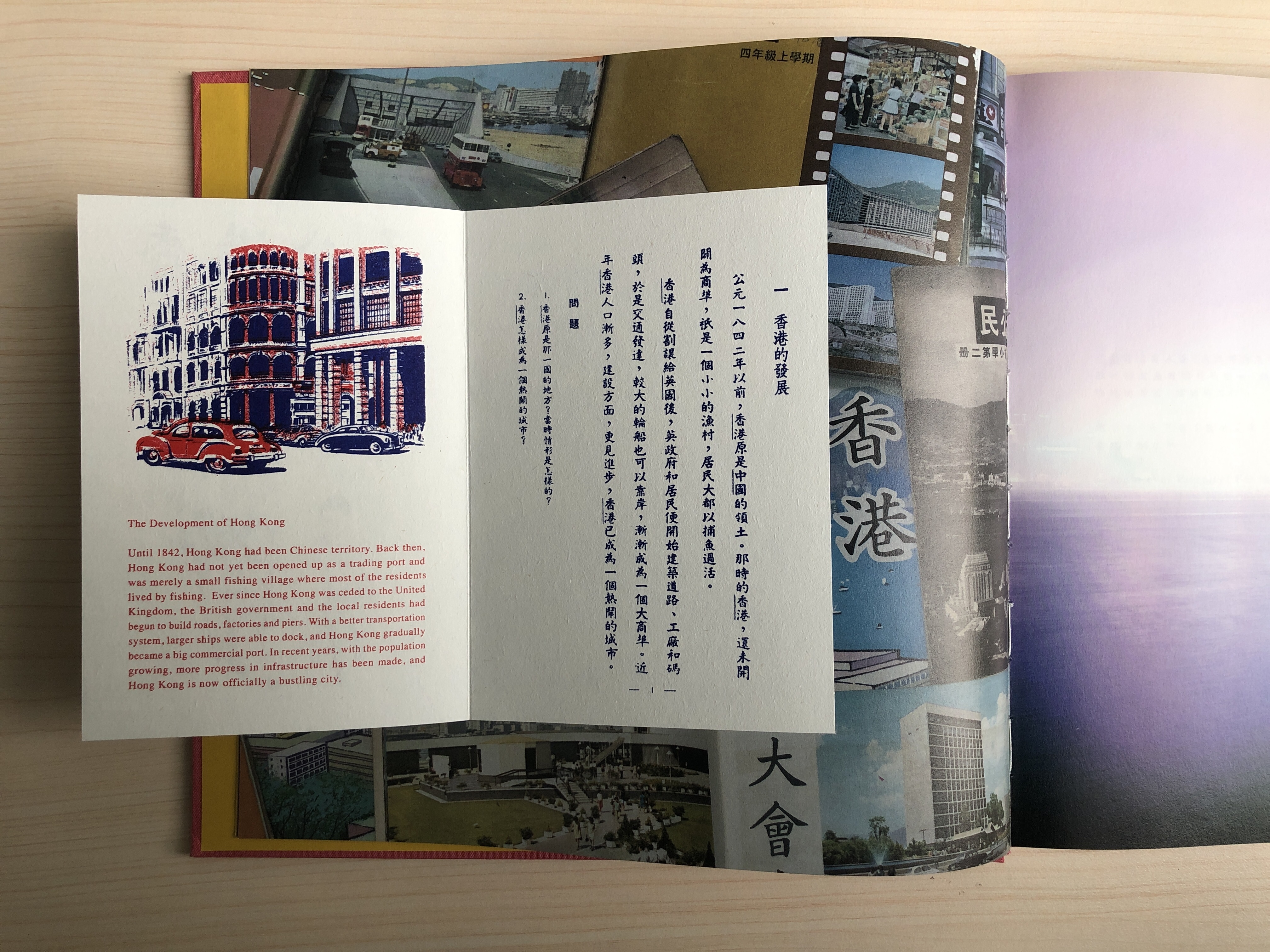
1 – black and white documentary – Blues by Alfred Ko
Blues by Alfred Ko is a photobook made in the 90s that talks about Hong Kong colonialism before the handover in 1997. At the back of the book the artist quoted, “my images represent a state of mind, an extraordinary state of mind prevalent before the founding of S.A.R.”. The book is chronologically arranged from 1989 up til July 1st 1997, the day of the handover. Throughout the book there are repeated gloomy skies and recurring icons of the status of the Queen. There is an image of people holding candles at Victoria Park, several images of airplanes against HK cityscapes and repeated images of banners with slogans that say “democracy”. They all symbolise the idea of “freedom” which was circulating in the city. In one of the images taken in 1993, 5 years before the handover, we see the back of a middle-aged man holding his left fist tight with visible veins while overlooking the harbour at a reclamation in Yaumatei. On the opposite side of the harbour parks many barges and cargo boats. It should be the view of Stonecutters Island, which was connected to the Kowloon peninsula by the West Kowloon Reclamation in the 1990s to provide land for the construction of the road and railway network to the new Hong Kong International Airport at Chek Lap Kok. His gesture reveals a kind of tension, symbolising the anxiety that people have with what is to come in the future. Overall, the black and white documentary images throughout the photobook generate a mood of tension and uncertainty. Perhaps it is this atmosphere and feeling that reflects a type of Hong Kong trait from a particular era.
2 – pop culture representation – The Dayspring of Eternity by Lau Chi Chung
The Dayspring of Eternity by Lau Chi Chung, on the other hand, was produced recently. It talks about the artist’s state of mind, or a representation of a state of mind, on Hong Kong colonialism as well but 25 years after the handover in 1997. The artist used a lot of found images from old newspapers, advertisements and tickets across the photobook. He also used a lot of text to narrate his nostalgic feeling towards the period of Hong Kong when it was colonised by the UK. The front cover image is an image of the sea with a purply hue and a lens flare. Some identified it immediately with Hong Kong’s Victoria Harbour. As D puts it, “the varying colour reflections in this image is very Hong Kong. I have only seen it here.” Others have more of a consensus feeling towards its sign of signifying dreaminess. As we went through the book, B picked up that the word 「香港」is prevalent throughout the book as well as the “Hong Kong font”「真體字」. Whether it is represented as a lightbox icon on an image or used as the text font throughout the book, there is no doubt that this is one of the iconic traits of Hong Kong.
3 – the young or contemporary – Teleportation by Lai Long Hin
Teleportation is a photobook created by a Hong Kong contemporary artist, Lai Long Hin. The photobook is a vast collection of snapshot pixelated images from his mobile phone photography. The work is split into 17 chapters. Each chapter consists of an array of images. Each image can relate to either one or the other or both adjectives from its title e.g. Treatment or Healing, Hiding or Invisible. The artist often zooms in as much as possible using his camera phone to focus on people and objects, excluding all unnecessary detail and clutter from his images. Hence, it is difficult to depict them connotatively as single images. Even when looking at them as a set of images from a chapter, they inspire questions rather than provide signs for readers to associate meanings to them.
In particular, I like Chapter 8: Still or Frozen. The first image is a girl frozen in her posture, leaning her right side against the wall while the boy leans forward. Next page on the left is an image of a few Guanyin statues. They are in crossed-leg positions and are floating on the wall. As I flip through to read this chapter, I began to question whether the images relate more to Stillness or Frozen. Other ambiguous images from this chapter such as, an image of a girl hanging upside down on a swing as if she was unconscious; an image of a pile of sand against a concrete wall; an image of many empty Bonaqua bottles uniformly standing on the floor. Towards the end of the chapter there is also an interesting diptych image. One is a close up of a man sleeping against a red pole, the other is an image of a lady with a similar facial expression but looking blank.
The joy in reading this photobook is in the details of the day-to-day that the artist directs us to see. How do we look for symbolism of Hong Kong traits from this work? Perhaps there are no commonly-known or easily identifiable signs such as Hong Kong font or people holding candles at Victoria Park. Instead, we make-meaning and associate the work to Hong Kong from the combination of the 500 pages thick photobook of images of gestures, objects, architectures and people.
4 – typological presentation – BLOCKS by Dustin Shum
BLOCKS by Dustin Shum is a photobook about the Hong Kong public housing estates. Found in the artist statement of this work, he mentioned that, “according to the 2010 statistics of the Hong Kong Housing Society, thirty percent of the territory’s population lives in public housing… public housing has come to represent typical living spaces in Hong Kong.” The photobook contains portraits of these public housing estates, almost all of them documented in isolation from people. Images are of architectural designs, exteriors and interiors of public housing communal spaces, wall graffitis, and traces of decays as well as renovations. There are a few set of images that display the before and after of the exact same location. For example, there is an image of On Yat House, Shun On Estate with handwritten notes on the exterior wall. The page after is an image of the exact same location yet taken a year and four months after. The image shows that the exterior wall is newly painted in a gradient of blue. The blocks on the sides are no longer dull in colour but in sharp yellow.
Although the work is very personal to the artist Dustin as he grew up in one of these public housing estates for 30 years, images from BLOCKS definitely have strong indications of Hong Kong traits to Hong Kong readers. Public housing estates often symbolise the low-income, ageing, and backward community that relies on social securities. They are also important monuments of the Hong Kong Government’s social policies during post-war years, as the dense multi-storey design was able to accommodate waves of immigrants from the Mainland effectively. Even without such cultural knowledge of Hong Kong, the lego-looking multi-storey design of these blocks are iconic to the city Hong Kong that can also be found in postcards, magazines and publications.
After a long and deep look into these four photobooks from Hong Kong, how do we make meaning about Hong Kong through the images in these photobooks? Are there patterns that emerge and is there a Hong Kong visual language? Is it important to recognise it and if so, archive it? Perhaps it is too early to say as we only really unfolded one small layer of this huge topic. What’s next might be to look into the history of Hong Kong photobooks and the existing archive of it from varying sources.
A review on the exhibition: m<other> by Kim Jee-Yun
While the research on ‘tracking Hong Kong visual traits’ is still on-going, I came across this exhibition m<other> by a Korean artist Kim Jee-Yun. The work on interracial families and the question on ethnic identity formation for the offsprings felt somewhat related to the fate and background of Hong Kong, a city of an intersection between the West and the East.
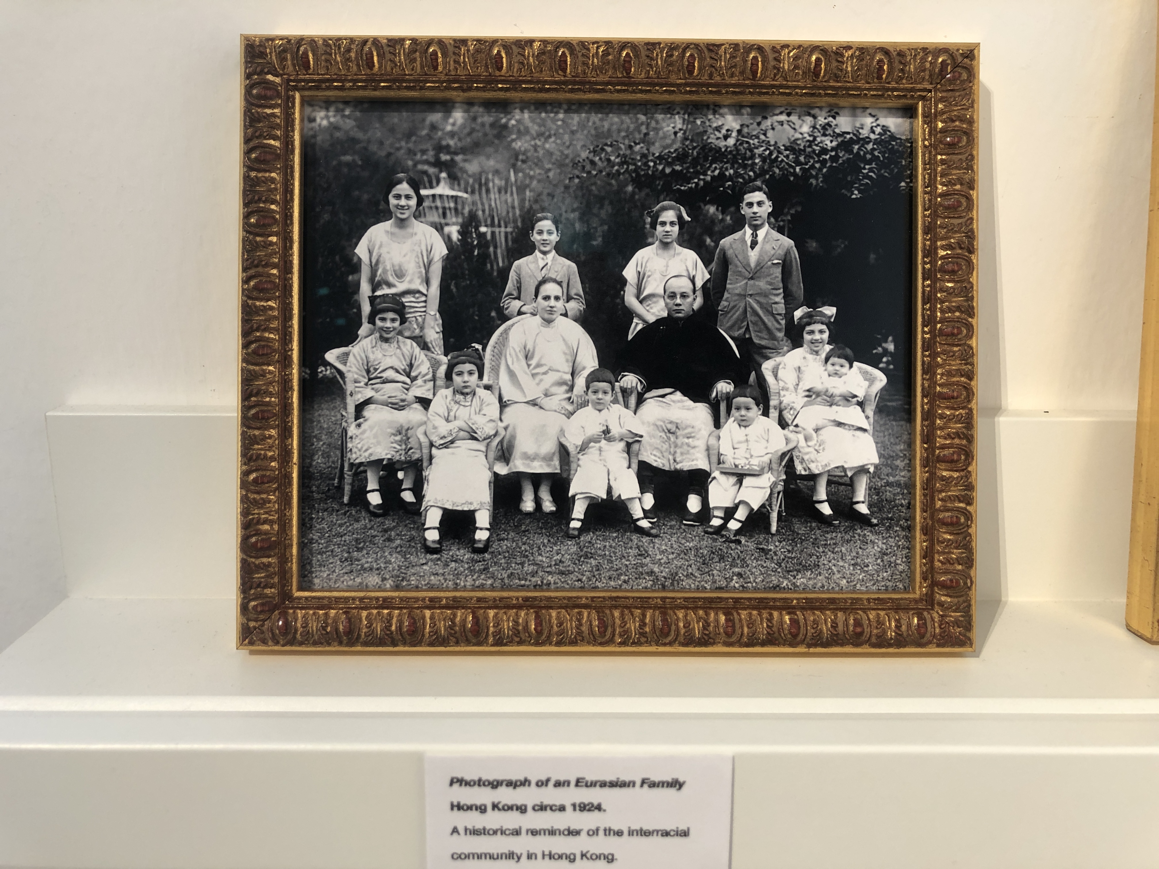
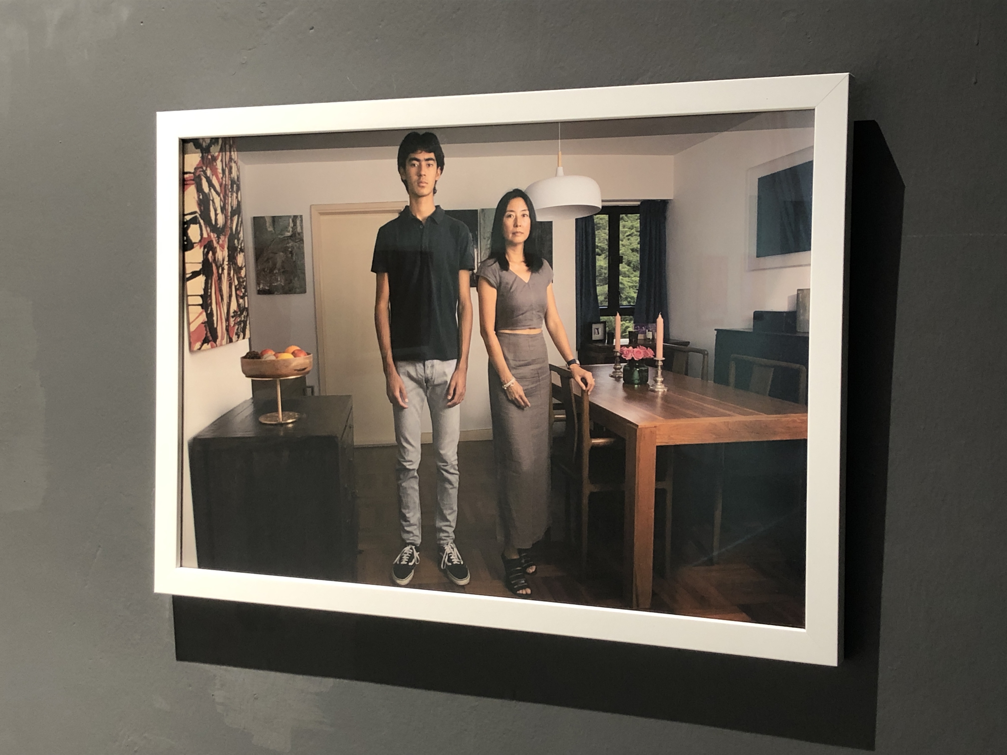
As I walked into Soluna Fine Art Gallery located in Sai Street, Sheung Wan, on the right there was a family portrait of Alia Eryes, the current CEO of Mother’s Choice, and her mother. And to the left by the stairs, it was the artist statement written by Dr. Vicky Lee, who wrote a book on Being Euasian: Memories Across Racial Divides. The tone sets in to focusing on mothers and femininity immediately, mirroring the theme of the exhibition. What drew my attention was the book shelf beside the artist statement. There were two archival images of Euasian family portraits in Hong Kong taken in 1900 and 1924 alongside Dr. Lee’s book. It gave me more context into thinking about the history of Eurasian community and how it all began in Hong Kong.
Little Edith Eaton says to herself, ‘Why are we what we are? I and my brothers and sisters. Why did God make us to be hooted and stared at? Papa is English, mamma is Chinese. Why couldn’t we have been either one thing or the other? Why is my mother’s race despised? … I believe that some day a great part of the world will be Eurasian. I cheer myself with the thought that I am but a pioneer. A pioneer should glory in suffering.’
From the artist statement, it felt that the artist was more interested in the mothers, and their visibility and presence needed to be acknowledged more so than the fathers within the interracial families. I wondered, why not the fathers? Lee wrote in her book that, “Any European employee who violated the colonial etiquette by interracial romance was jeopardizing not only his career but was also risking ostracism…Kenneth Andrew recalled that the first document he had to sign was a promise not to marry a Chinese female (Langford, 1998)”. It feels as though the hostility of interracial marriage is mutual between mothers and fathers, so I wonder whether there was something else that the artist felt with mothers that needed to be acknowledged.
Looking at the images, the images of the mothers and their child often took place on the bed, or sofa or a corner of their home. Lying down, sitting or standing, they were stoic with seriousness or slight grin on their faces. Perhaps it carried on from the idea of traditional painting where wider smiles were “associated with madness, lewdness, loudness, drunkenness, all sorts of states of being that were not particularly decorous”. Or perhaps the artist wanted the images to represent power and seriousness of these interracial families. Serendipitously, I met the artist on the day of visit. She told me her photographic process, “I asked them to find a place that is comfortable. For example, for a baby it would make sense to have the 2 hours photography session on the bed. I asked them not to smile, because this is documentary photography. During the shooting, I show them the photographs I took. The camera is a mirror to show them how they want to be represented. They changed their pose to adopt to that and we agree together on the final image.” The work became interesting in that it is a collaboration with the interracial families in creating a pictorial representation of how they want to be seen. And then what fascinates me is when the family being photographed have the power to control how they are being represented in images, their choices of poses can also infer how they want others to see them. The power of their presence becomes not only being who they are in front of the camera, but also how they want to be seen by others.
From the clothing that the mothers wore, the objects, and surrounding environment in these portraits, all the works presented in this exhibition reflected social-economic privilege in the interracial families photographed. The artist mentioned to me that the choice of families are those amongst her network – friends, neighbours. Slowly she advertised on social media recruiting mix-raced families who want to be photographed. How is her method of selecting families to photograph affect the way audience understand and learn about the psychological and emotional depth of interracial families in Hong Kong? Perhaps this is something to explore further too.
Amongst the photographs, one photograph of an Indonesian mother with her baby boy drew my attention. According to the gallerist, she was often mis-represented as the domestic helper. I wonder how her interracial marriage experience is in comparison with the others, especially in relation to the culture of this city Hong Kong. It was a shame that the exhibition only presented the images of family portraits. I felt the exhibition would have been more enriching if sound recordings of interviews about the families’ experiences of interraciality were included. I felt this would have given more layers to the body of work and to the theme that the artist wanted the viewers to ponder upon.
I know this is a very broad question, and maybe a retarded one too. But I wonder, if there were no texts disclosing where the image was taken, or if the image was taken out of its original context, would anyone be able to read or recognise whether this image is of HK or not? And hypothetically, if we aren’t living in HK or have been to HK, would we be able to tell or value an image of HK? And then I wonder, can there be “HK images” that are not taken in HK? How do we value images that recall a sense of belonging to this land, HK?
I love Chan Long Hei’s zine The Blooming Souvenirs. I found that it is an excellent example to ease into the above questions. Souvenirs of Hong Kong are symbolic objects that are designed and marketed to be the brand image of Hong Kong. They can be purchased as an association to the city itself. Here, the image of the Hong Kong’s emblem, a giant statue Golden Bauhinia flower located at The Golden Bauhinia Square where the daily flag raising ceremony occur, is transformed into different types of souvenirs such as puzzles, nail clippers, fridge magnets etc. Since Hong Kong’s handover, these replicated souvenirs seek to display their political history in an engaging way. Not only do these souvenirs represent Hong Kong’s touristic experiences, but they also imply the imagery of Hong Kong’s prosperity metaphorically. When the souvenirs are brought home, they recall a sense of belonging or ownership of the land.
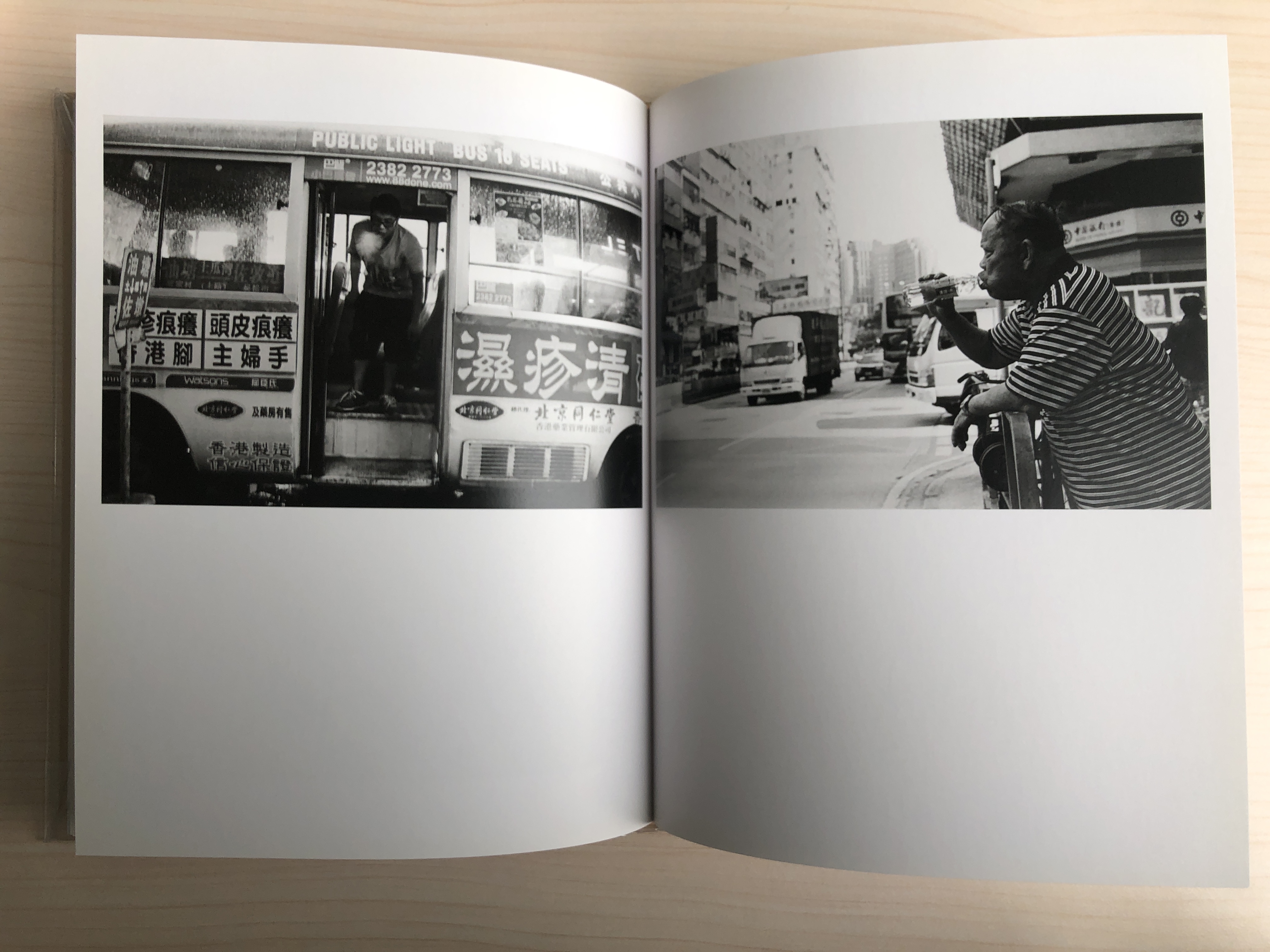
Yau Ma Tei by Chan Wai Kwong, on the other hand, speaks of HK visual codes through the way he photographed. This photobook is his first published monograph focusing on the Yau Ma Tei neighbourhood of Hong Kong. His use of candid and unpretentious visual language reflects the area honestly, neither subdues nor favours either landscape nor individual. He faced everything and photographed anything. Perhaps it’s this style of visual language that we see honest and vernacular images of street traders and local residents gather, the old and the young, revealing glimpses of visual elements of HK such as HK buses, Chinese neonlights and phonebooth, and the textures that represents HK.
With Under the Flyovers by Chau Ho Man, the HK visual codes become less recognisable in my opinion. Although all images are shot in HK, the landscape style of capturing the world under shadows of flyovers creates this feeling of otherworldly. The way it was printed on black paper with silver tones made it even more so. It feels as if I was travelling in the realm of hell when flipping through this photobook. I then wonder, without the sensitivity and awareness of the visual culture of this side of HK, would we be able to recognise these images and more so, value these images as images of HK.
While the style of photography matters in recognising HK visual traits, The Queens by Wong Kan Tai brought another interesting aspects to this topic. The book is a collection of Hong Kong and Macau’s streetscapes from 1977 to 2009. These photographs are mixed in the photobook to narrate “a borrowed time, a borrowed place”, like the essence of a hotel, as Wong Kan Tai explained.
He said that these two places are like twin brothers, a Portuguese colony for more than 400 years, and a British colony for 150 years. There is only a little time difference in their development, but there is not much difference in essence. In the photos, one can recognise HK with iconic visuals such as, the passenger plane flying over the Kowloon Walled City that is about to be dismantled, the important ceremony of the withdrawal of the British army in 1997, the scenes of citizens celebrating in Statue Square on the day of the handover etc. However, what intrigue me the most is that there are some photos that led me to question whether they are taken from Hong Kong or Macau. For one, the visual style of the book was consistently photojournalistic which makes it harder to distinguish which city the images were taken from. But more so, in these images, I find that the cityscape of Hong Kong and Macau is so similar that when I cannot recognise any iconic visual codes of HK when viewing these images, I become suspicious of their locations. I then wonder, is there a recognisable or traceable visual codes for cities with similar fate and background, as Wong Kan Tai mentioned? Could a way of tracing HK visual traits be about tracing the imprints and relics of a colonial era?
Lastly, The Dayspring of Eternity by Lau Chi Chung I feel is a personal photo essay (rather than a photobook) about Hong Kong. He uses the pop song <黎明不要來> from the 80s as the title of the book to metaphor his question on whether there is such thing as “permanence”. The book walks us through the Hong Kong history as well as his imagination and personal feelings towards Hong Kong via archival materials from pop culture, his photographs and texts. I feel the primary work in this book is the texts, while the images are supplementary to the story narration. Within those photographs he took, the visual codes of Hong Kong are more prominent in some images than others. There is a documentary image of the State Theatre in North Point, and then there is an archival illustration from HK old school textbooks, which visually both very much signifies HK. On the other hand, there is an image of a table covered by a laced tablecloth with toilet rolls on top and someone who looks like he’s doing calligraphy. Here, the HK visual codes become harder to identify. What interests me most with this book is that, instead of the visual representations or the visual style of the images that resonates with HK, it is the approach to the design and narration of the book that feels very HK to me. The narration is very much in sync with the melody and lyrics of the pop song – melancholic and nostalgic – which is the general theme of HK pop songs back in the 80s.
黎明請你不要來 就讓夢幻今夜永遠存在 Dawn please don’t come, let the dream exist forever tonight
讓此刻的一片真 伴傾心的這份愛 命令靈魂迎入進來 Let this moment of true love welcome the soul in
Before we can dive deeper into tracking HK visual traits, the discussion about HK visual traits gets blurry and confusing when we cannot define what we mean by “visual traits”. To my understanding, it is a combination of visual semiotics (ie. the visual elements that signifies HK), visual style (ie. the style of the image created) and visual language (ie. the way these images narrates a particular story).
This will be further discussed in my next writing, which will also be the topic of the next Photobook Club session in February 2023.
Art no longer is solely an individual expression. Other than collaborative art-making, we are growing interest and sensitivity towards how art can be a connectivity tool to extend to the community and public engagement. While the classic way of making and enjoying art still has its own value, the placement of art has been shifting towards collaborative and participatory, whether it is within the creative processing in making the artworks themselves or to create public engagement when experiencing the artworks.
In recent months, there were several exhibitions that revolve around this theme which are worth discussing.
A jointly presented project by LCSD and the Wan Chai District council, the project is curated by no discipline limited, inviting six artists to create community art experience as a way to use art to connect to the community.
“In communities, art is not only functional or a mere tool for problem-solving. Community arts can also widen our senses and experience. Once our mindset changes, the surroundings and even ourselves are open to a broader world.”
The prelude exhibition at Our Gallery, Wan Chai was a way to introduce the work by the six participating artists, using different media, to create the community art experience in the coming months.
Our broom, by Luke Ching, was a memorable one as I participated in the workshop which led me to think more deeply about brooms and street sweepers through our experiences in making the brooms and creative sweeping. Through embodied experience in creating symbols or Chinese characters made by fallen leaves, we are inspired to widen our senses and as a collective look deeper into the issues around brooms and unlock their possibilities. Here, the artist involved the community and the public in the actual artistic processing and in making the artwork itself. The other five artworks also use a similar methodology but through different mediums. For example, in the prelude exhibition, Lawerence Lau, uses “a chain of dialogues”, to invite the public the write their questions that they may want to ask if they meet a stranger in Wanchai on a notebook, and write their answers to the previous questioner. Using sound as a medium, he will continue with this methodology on the streets of Wanchai in the coming months and create a music gathering at the end with people who participated.
I look forward to seeing how the finished work will be presented, if they may, to the public once again or whether the work is left to be ephemeral and to be experienced live only.
left: Our Broom by Luke Ching, photo by Luke Ching, middle: instruction for “A Chain of Dialogues”s by Lawrence Lau, photo by Michelle Chan; right: notebook of “A Chain of Dialogues” by Lawrence Lau, photo by Michelle Chan
Curated by Tai Kwun Heritage team, along with a researcher team and design partner One Bite Studio, seven artists were invited to use art to respond to what has been observed around the Central and Sheung Wan neighbourhood. The exhibition adopted “Modernologio”, an everyday life observation practice originated in Japan, as the research method to identify the interconnections between people, space and activity.
Here the exhibition becomes a documentation or a way of showing the findings from the social research made around Central and Sheung Wan neighbourhood, with artworks such as drawings, sketch statistics, short films etc as representations of the findings. Although the exhibition also revolves around the community of Central and Sheung Wan, the value of the exhibition is in the objectivity of presenting a specific community through the work of art. The majority of the artworks is passively engaged with the public, with one section that invited the public to draw their own imagination on how to reuse the prison yard space in Tai Kwun.
For me, this is definitely not participatory art and I’m not sure whether I can call this community art either. There’s definitely a stir within the art world to shake things up in how we define art and how we present art in exhibition spaces like Tai Kwun.
Initiated by artist Kong Yiu Wing, this exhibition was an extension of his previous work built from 2019 where the artist invited the public to donate objects that pertains to the theme “HongKongers”. Personal objects including household items, relics of the movement, old photos, documents, multimedia, 3D model etc becomes an archive for the HongKongers, so to speak. Here the value of the work rests upon being a preservation of a history of the community’s subjectivity about Hong Kong.
From collecting items to creating a system to archiving these objects, every step of the way becomes a question to decide how much to insert the artist’s curation and how much to leave it open to public participation. And further, is this a question that should only be addressed to the artist himself or can we inspire the public to think together?
At the talk, there was a lady who picked up the documented files and started correcting mistakes. She expressed her disappointment with the mistakes she found in those documents. I wonder, instead of standing in opposing position to point out what was wrong, can we, as artists and curators, inspire the public to involve in bettering the archive in a collective way? And can we, as the public, question ourselves in how to contribute to bettering the archive?
I look forward to see how this project evolves, and wonder the direction that the artist will take as the sole holder of this archive, yet also represents the community of Hong Kong.
a documented file of an egg tart mould, photo by Michelle Chan
Part 1. Kosuke Okahara on photographing with a free mind
“If there’s a pure form of documentary photography, the picture should not be influenced by any preexisting visions.”
Having been working on a story about the impact of drugs on local community in various parts of Columbia for 13 years, Kosuke Okahara became able to predict the kind of scenes that he would see even though he was in different towns, and in the way he would frame the images.
“It’s like I was trying to see what I’ve seen already… it’s almost like I’m copying myself…”
“I asked myself – am I documenting or am I just taking pictures of the situation that I kind of wanted to see… ” he quoted.
A former aspiring Olympic skier whom became a W. Eugene Smith Fellowship recipient, Japanese photographer Kosuke Okahara shared his struggle with the philosophical dilemma he had with documentary photography, and his journey to finding his ways through making the work The Blue Affair.
The Blue Affair is a a work with photographs taken in Koza, the heart of Okinawa, which gave Okahara the refreshing sense of being a photographer with a beginner’s mind again. The repeated visits without a specific purpose in producing a story somehow led to the people, the conversations, the happenings he encountered from this place infiltrating his dreams — as if these were symbolic gestures in nudging him to return, and at the same time, to relight his inner flame and re-experience again the joy of just pure photography.
“… being more conscious takes one away from the purpose while getting ride of the purpose is the only way to get closer to the intent. In that sense, documentary is like a tragedy of fate. Achieving by losing – like a Shakepearean play.” —extract from the afterword written by Tatsuya Ishikawa, of the photo book The Blue Affair by Kosuke Okahara.
Are we really creating images from a fresh eye every time we shoot, or are we already building on from pre-existing images of what to be seen? How can we be more aware when the way we photograph becomes purposeful rather than being open and honest with what is there to be seen? And how can we remove ourselves from the position of already knowing and begin again with a beginner’s mind? These are the questions to ponder, and with the blue affair, Okahara has shown us that it is possible.
Going through The Blue Affair book gave me chills. It’s the kind of book that gives you a visual journey in a way that you are drawn in as if you were present with the photographer, experiencing what he was experiencing at the same time. That’s the kind of work I aspire to work towards, because the work that one would remember the most, are the ones that are felt.
His recommended Photobook: Rasen Kaigan by Leiko Shiga
Ever since I came to know Krishnamurti (thanks to a friend who introduced me to him), this question he pointed out has been stuck in my mind ever since.
“Can we look at a tree without the image of the tree?”
Can we really look at a tree, without translating it with our own terminology, categories or temperament? Just looking – just seeing what’s in front of us – seeing what is actually taking place, and feeling it without words of interpretations?
II.
It reminds me of another piece of reading that I loved by Brian Massumi on the autonomy of affect.
“A man builds a snowman on his roof garden. It starts to melt in the afternoon sun. He watches. After a time, he takes the snowman to the cool of the mountains, where it stops melting. He bids it good-bye, and leaves.”
Researchers took this short-film and turned it into 3 versions: the original voiceless version and 2 with added voice-overs (one factual and one emotional) and gave them to a group of 9 years old children to watch. What was astonishing from this finding was that the original non-verbal version elicited the greatest response from the children’s skin, the factual voice-over was the least unpleasant and the emotional voice-over was the most remembered. The result clearly showed us that our body responds to what we see before the formation of words. And then with the addition of words, they amplify or dampen what is being seen. Even with factual descriptions, it linearised what and how the images were being looked at, and in turn became an interpretation of what we see.
Note: In the case of watching a film, we are looking at consciously indexed moving images. This means that there’s an intent of how those images were framed when creating the film for the audience to look at. But the takeaway here is that – what we see produces a primitive affect prior to any input of words, whether we are consciously aware or not.
III.
So, can we look at a tree without the image of the tree?
Zheng Bo, a Hong Kong-based artist, who spent his art practice working with plants mentioned that, the whole point of his daily rituals of drawing plants, is so that he can look and study the plants. He said that his artworks of plants are of no mastery of craftsmanship, but the experience of daily pencil-drawing of the plants made him slow down and look at the plants closely. He was documenting his experience of looking at plants.
IV.
As a photographer and a psychologist, I’m fascinated by looking – the way we see – the images we form both mentally and physically. With this question in mind, I did an experiment with photographs, with the intention of just looking at trees.
I picked a tree randomly and began looking at it from the bottom, where the roots are, then moving up to its branches and observed how they separate, and finally gazed upon the leaves and the fruits. And then I realised, the moment I took a photograph was the moment that I compared it with my mental image of a tree. I was photographing something that’s outside of my mental image of trees as new knowledge for me to keep. After this realisation, I then decided to not photograph anything and just observed. I watched my thoughts while I was just looking at this one particular tree, and I saw myself comparing that with what I know about trees, “oh the branches on this tree have such irregular shapes!” “the roots here are super interesting, they look like claws” etc. It seemed like the space between the looking and the thoughts is abducted, or maybe I just wasn’t aware enough of the gap in between. So I tried again. This time with a different tree. At first I did the same thing – I started from the roots and slowed moved up my gaze. Then I noticed the moment I took the phone out it changed the way I was looking at the tree. The act became purposeful in capturing something. So instead, I started all over but this time using my phone camera live view as a lens to observe the tree. I zoomed in as if I leaned forward; and zoomed out as if I took a step back to see the whole tree. Then at those moments where I was just looking with my mind emptied, I pressed the shutter. Something magical happened. The captured images have this sense of deadpan and mundane. They are really just ordinary, and at the same time I’m fascinated. I bet these are some of the images that one wouldn’t even spend a second and swipe to the next.
V.
Looking at a tree, without the image of the tree, documenting it as an image, and looking at the tree in the image. What do you see?
If I am to be completely honest, writing has been with my life even more so than photography. Since I remember I kept a diary close to me and it’s been something that I make sure I do every morning til this day. There’s always been this little voice inside my head that says I should write more but also not really knowing what it is that I should write. So I started and I stopped. I wrote a bit of this and that, and then I stopped again. This cycle repeated endlessly. The creative resistance is huge. Not good enough writing. Not good enough topic. Not interesting enough. Not genuine enough. Etcetera etcetera. I have struggles to make myself sit and sift through my thoughts to come to something that I feel is “presentable”. But maybe that’s the very idea that is blocking me.
I once read a letter of Vincent Van Gough to his brother, Theo, from October 2 1884, he wrote,
“You don’t know how paralyzing it is, that stare from a blank canvas that says to the painter you can’t do anything. The canvas has an idiotic stare, and mesmerises some painters so that they turn into idiots themselves.
Many painters are afraid of the blank canvas, but the blank canvas IS AFRAID of the truly passionate painter who dares — and who has once broken the spell of “you can’t.”
So this whispering voice is coming back to me again. And this time I’m determined to break this spell of “you can’t” and just write. Like Picasso would say, “you have to start painting to know what you want to paint.” A blank page is a scary thing to a writer, it is different to photography where one picks something from the world and frame it. One has to clearly organise their thoughts so to articulate exactly what they want to communicate. So here I am again, starring at this blank page and my fingers started to type, and then holding the delete button and retype again. Something beautiful came about from this act of back and forth, and then words start to imprint themselves onto this blank page forming sentences and paragraphs. Maybe all I really needed to get pass was the very first 15 minutes of panic, and just let myself sit through this uncomfortable space of the unknown.
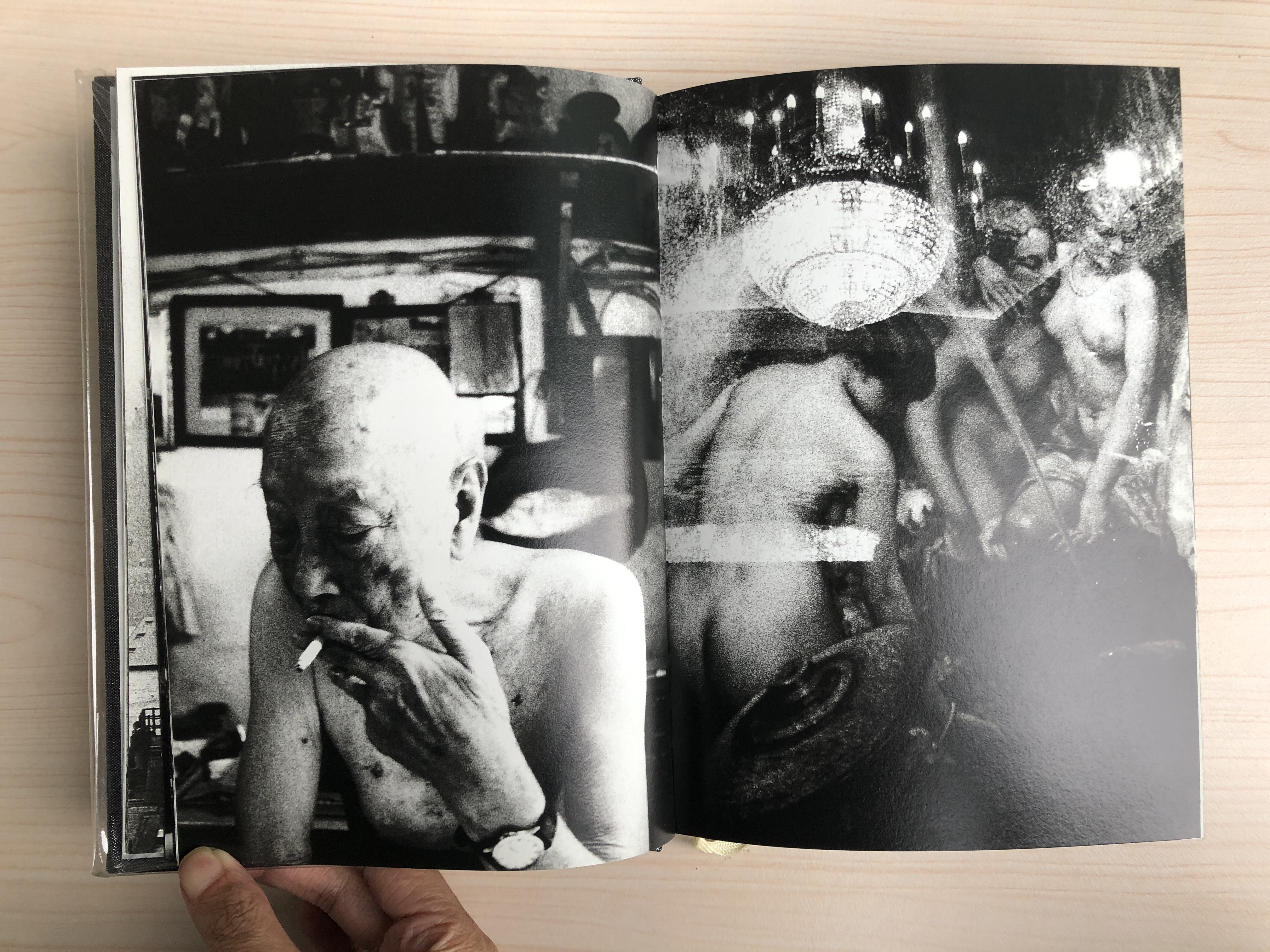
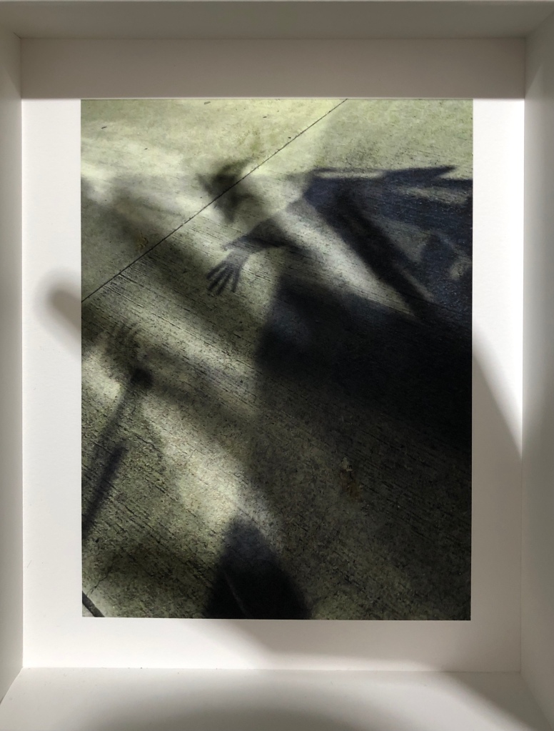
Yesterday I went to the exhibition opening “Hello! How are you? — A Photo Exhibition by So Hing Keung” at Lumenvisum Hong Kong. I noticed that usually art reviews or exhibitions go-to articles are mostly written in Chinese (because after all it’s mostly for the local audience) but honestly, I’m just way more comfortable with writing in English. (Perhaps this can be useful for those outside of Hong Kong to know more about Hong Kong art and artist.)
I once did a workshop with So Hing Keung and his work is very much influenced by Josef Sudek. A lot So’s previous work, even the work at this particular exhibition, are mainly photographs of still life and rarely does he photograph people. His interest in photographing traces in our ordinary life draws our attention to the little things that we may overlook daily. In this particular work, he drew his attention to his shadow (which he refers to as death) and its relationship with objects and the surrounding environment. Playing by the idea of how photographers usually avoid shooting shadows, he purposefully investigated this relationship to question and document his existence.
Further by displaying these photographs of the shadows in an exhibition format, it has an after effect of creating an illusion of “saying hello” and inviting the audience to join in the conversation with his shadows in co-creating our existence wit those photographs. On one of the walls, there are 4 large panels of work with one that looks like Lo Ting, a species half-human half-fish, indigenous to Hong Kong, as the poster of the exhibition. He referred these panels as “death rolls” and hence the looseness of the mount. The rest of the work were displayed in an organised home deco style of 15-20 thick white frames along the other three white walls. The frames were small and glassless, allowing the audience to look closely, like peaking through different windows, to speak to these strange aliens that never come to light.
The work has a certain subtlety yet with a quick glance it can easily be interpreted as gimmicky and literal. Especially with the limited gestures (often with a hand wave) and rigid body postures of how the artist interacted with his shadows, I feel the work can be expanded much more if given the range of diversity to play. I guess this work comes with resonance to the previous days of working from home, social distancing and lockdowns where one would begin to ask deep questions about our very own existence, especially when we cannot relate to the physical world. Our shadows become the very fundamental thing that brings us back to our sense of placement in this world. Here, So recreated this journey for the audience to experience how we can reconnect with ourselves and the world.